Messaging for Airbnb
About the project
In 2018 H1, I hosted a design sprint with the foundation team on the future of contact host experience. We designed the vision for messaging, that could provide more transparency, expression and immediacy for China and global users.
We did both Chinese and English UI during the sprint.
My role
This project is a collaboration between China team and the foundation team. Foundation team has domain knowledge of messaging backend and component, while each product team have knowledge of the product features.
I arranged and hosted this design sprint. For design mock ups, I collaborated with Roy, designer on platform team using Layer Tennis.
Background research
One challenge is that , I need to understand the problem, and share it with the foundation team, who doesn’t have much context around China.
I created a kick-off deck to organize my learnings to communicate with foundation team. It includes some pre-work I did:
Data informed
I asked our product specialist to pull up a few hundred messages, to understand what are people are chatting about. Besides, I played around with airbnb data dashboard to check our user behaviors, and found that China user has higher intent to take some actions, while it’s less likely to become a booking.
Comparative analysis
In addition to look at our flow, I also want to keep the broader context of China in mind. There are many nice features, but the most important thing is, the sellers are replying so fast, usually in a few seconds. Trained by mainstream marketplace apps in China user expects fast responses from sellers and instead of browsing, it’s super low cost to get answer from the chat.
Part of comparative analysis
Audit current flow and emotions
I also want to highlight user’s feeling reaction to airbnb flow to build up empathy.


And this is how things could go wrong along the user journey:


Identifying the problem
Obviously there are many small things that we could improve. During the sprint, I collected problems and ideas using affinity wall to group them into three big categories:
Transparency: The user does not understand what’s going on nor what will come next
Expression: Not able to express themselves efficiently nor authentically
Immediacy: The information is not delivered in a timely manner


HMW and solutions
Based on the problem areas, we have three How Might We questions. We brainstormed based on the problem areas and voted. Eventually have three solutions accordingly.
Whiteboarding
After having a clear idea of ‘how might we’ and solutions. We created a storyboard in text first to clearly list out the user flow, and did wireframes to visualize it.
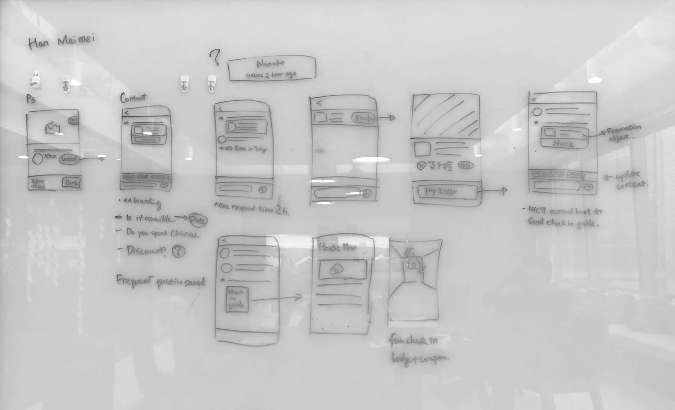
Layer tennis
One challenge is that, we will test our design with Chinese users thus it must be in Chinese. The other designer does not know Chinese at all. How do we collaborate?
As we are pretty align on the storyboard, I took the lead to design product features, make it in Chinese first, and then translate them into English version with clear narrative of user behaviors. Thus, he could understand and give valuable feedbacks, and also think about how to apply it in global.

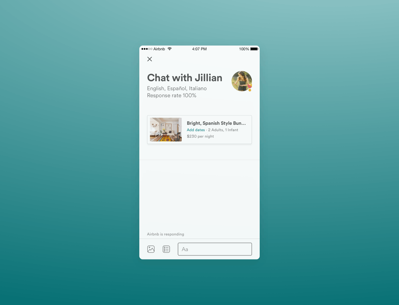
Hi-fidelity design
We did both Chinese and English version UI. Let’s look at the universal version first. The screens below are highlights of pre-booking journey. In the real project, we did full flow for both pre-booking and post-booking contact.
I did prototype use Principles for testing and sharing within China team. For communication purpose, I use the English version below. The animation is made by our wonderful motion designer.
Today
A guest must fill out an Email-like form to send the message
A guest must manually type their questions and wait for the host to respond regardless of varying time zones
Tomorrow
A guest can go straight to chat view
A guest can tap on a question to receive an auto-response from airbnb. Reveal answers to commonly asked questions that are relevant to the booking and the trip
Today
A guest need to translate in other apps and paste in airbnb.
Tomorrow
A guest can use quick input to share basic information
Today
Text status that’s hard to understand, such as ‘Pre-approval‘
Just plain text messaging
Tomorrow
Milestone cards that contain more contextual information and a clear CTA
Stickers add humor and soften the communication – reducing the chance of a misunderstanding
Chinese version UI
Because the the concise nature of Chinese UI and some UI patterns that users are already familiar with, there are some differences between the versions.
For example:
FAQ could use buttons instead of a scrolling bar
Quick input can fit in both the English and Chinese translations
Users are more used to have actions on the right side of input bar
User research
I collaborated with our research on a paper prototype testing in Beijing after the sprint with 5 exist users and 3 new users. All participants self identify as low-mid English capacity.
After discussed with my researcher, we decided to make paper prototypes to simulate the real conversation. I quickly put together the paper materials for testing - it was really fun!!


During the research, we found that most of the features, such as the clear entry, milestone card etc, remove confusion a lot, and are appreciated by users.
One interesting finding is, Mid-low English level users don’t get the value of shortcut input. We initially thought, they would want an easy way to greet the host and share basic info in a nice tone. However, because of their English level, users don’t see what’s the difference between tones, and don’t understand what does the english mean.
Some more iterations
I then realized that there are two type of users. One is more empathetical - they want to be polite and thoughtful, and they would like to make sure they send the right sentence. The other one are more self-centered - they feel the host should translate it because they are doing business.
Maybe we could follow their natural behavior - typing Chinese directly into the conversation? What if airbnb could automatically translate it? Thus, I add some further exploration into this, focusing on translations.
Stickers
I collaborated with Illustration and motion designer on a set of sample stickers that serve specific purpose, and soften the communication. In the process, I learnt a lot on how to collaborate with external illustrator, and the narrative nature of animation.


Result
Some problems are universal - the three problem areas we defined in sprint now become principle of airbnb messaging. Many components we defined has been baked into the messaging component library.
The sprint outcome got China team alignment on future direction of messaging. We are now waiting for the backend ready.
Challenges and learnings
One realistic challenge is the context and the language. I did many studies around previous learning and map it out to our user journey. It works really well to let stakeholders understand the problems we are trying to solve and align on it.
Below is a direct quote from PM of foundation team.
Also, during the sprint, we are working on Chinese UI. In order to better collaborate with designer on foundation team, I do UIs in both Chinese and English, so he could understand and critique.
“Xin strikes me as a highly productive member of the China team, and she and I collaborated on messaging for the Chinese market. Our collaboration certainly exceeded my own expectations in that I learned much more about messaging in the Chinese context than I would have otherwise known without Xin’s help. Xin also combined my work and her work to create hybrid messaging design that will work on the new platform and serve Chinese customers more specifically. I benefited both from her understanding and patience, as well as from shareouts and artifacts created during our collaboration.”