
Check-out Experience
Context
In 2018, our team worked on improving the check out experience (we call it P4) to help China guests feel efficient and confident to make a decision by reducing frictions and building confidence.
Platform: Native and Web
My role: I’m the sole designer on this project to champion user experience and business goal. Hosted kick-off meeting and design reviews with key stakeholders for alignment.
Understand the problem
Our team’s business goal is increasing booking conversion. But what is the real user problem?
I broke down the P4 page into two parts: the overall structure, and the sub-flows. The check out page is an overall page that has sections, while each section has its own sub flow, such as coupon, or ID information.
Let’s zoom in to the overall structure first:
The overall structure
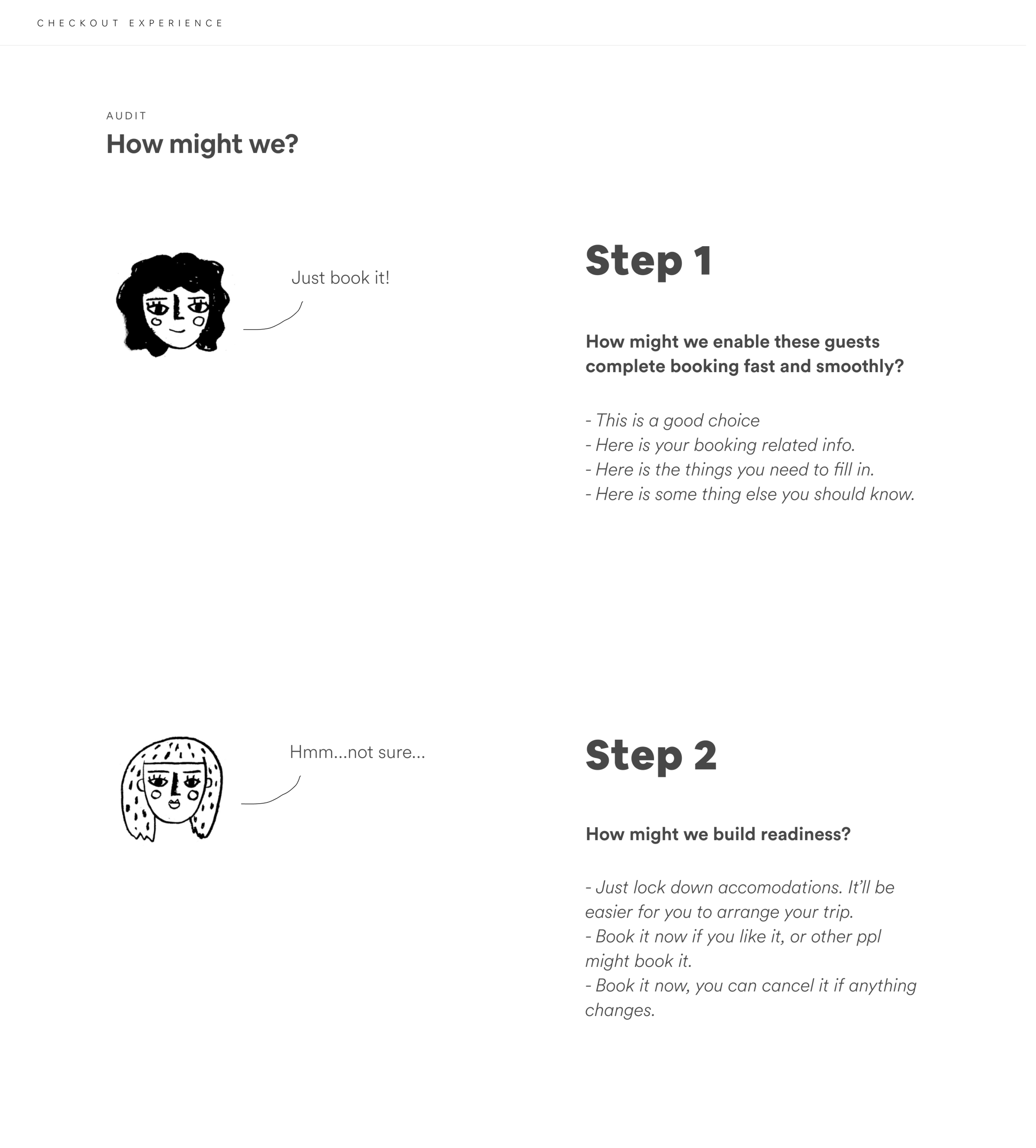
When a user come to the check out page, they either ready to book, or not so ready - of course, because of certain information, they will be switch between types.
Based on the two user types, the user goals are different - thus the information they need are also different.


What info do we have?
The check out page (P4) are made by sections. I listed out all the sections we have on airbnb, and categorized them - they actually fall into 3 categories.
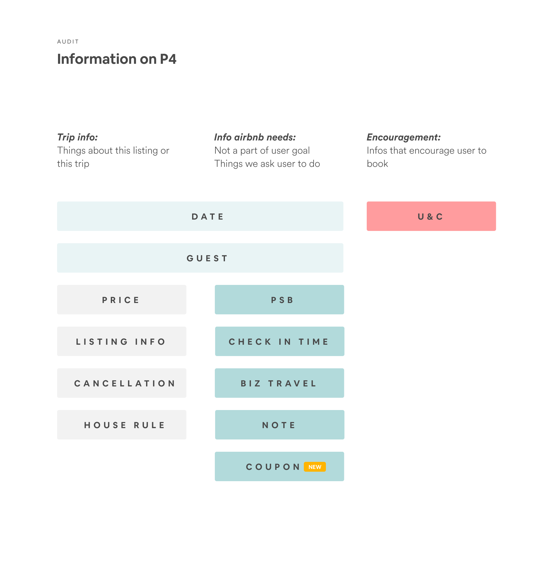
If we color code our current P4, it’s clear that different type of information are spread out all over the place. It’s not intuitive why certain section is in certain place, while some sections, such as coupon, is missing.
As a result, it’s not efficient for users to browse and move forward.


A better way to present sections to user?
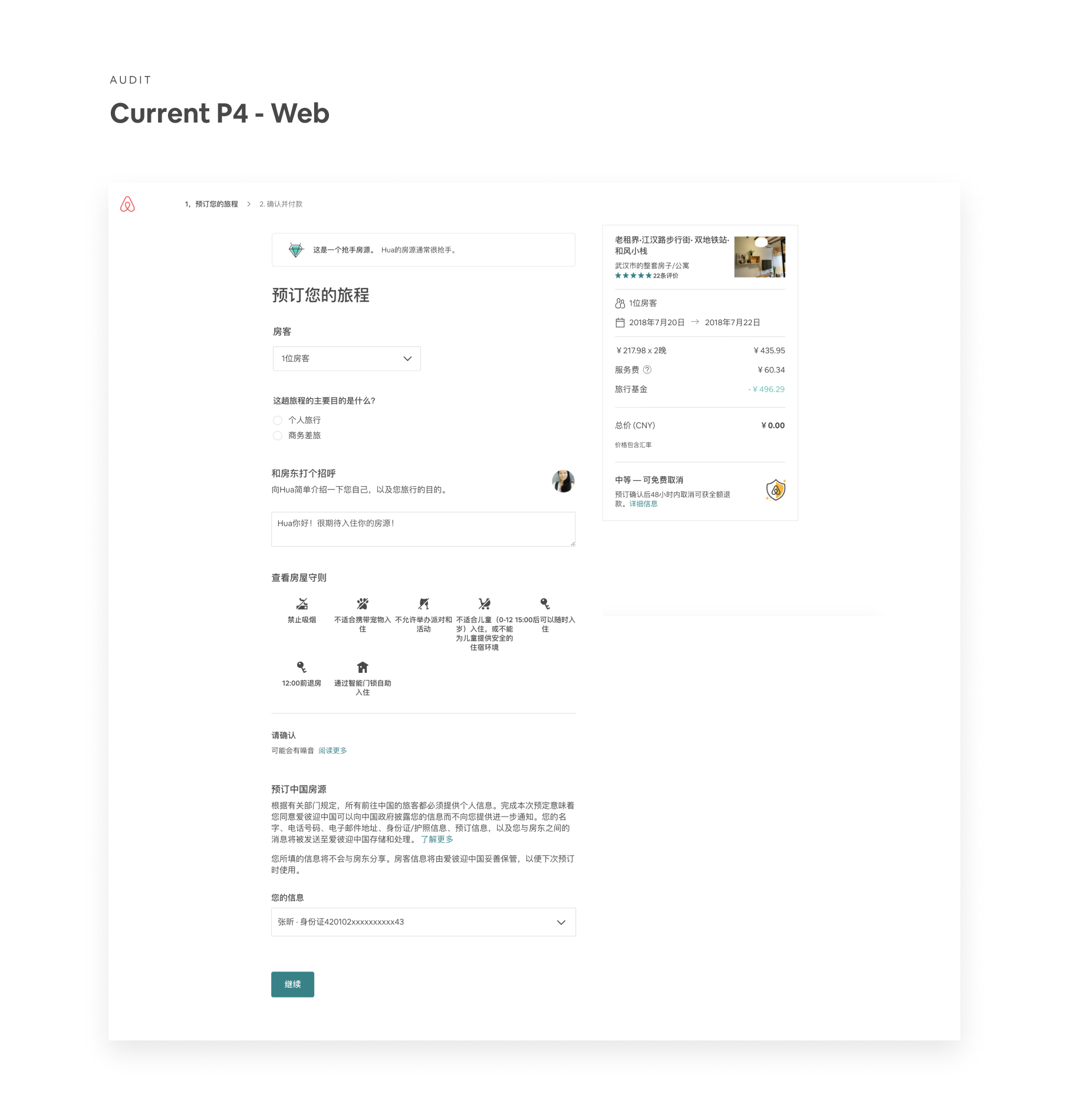
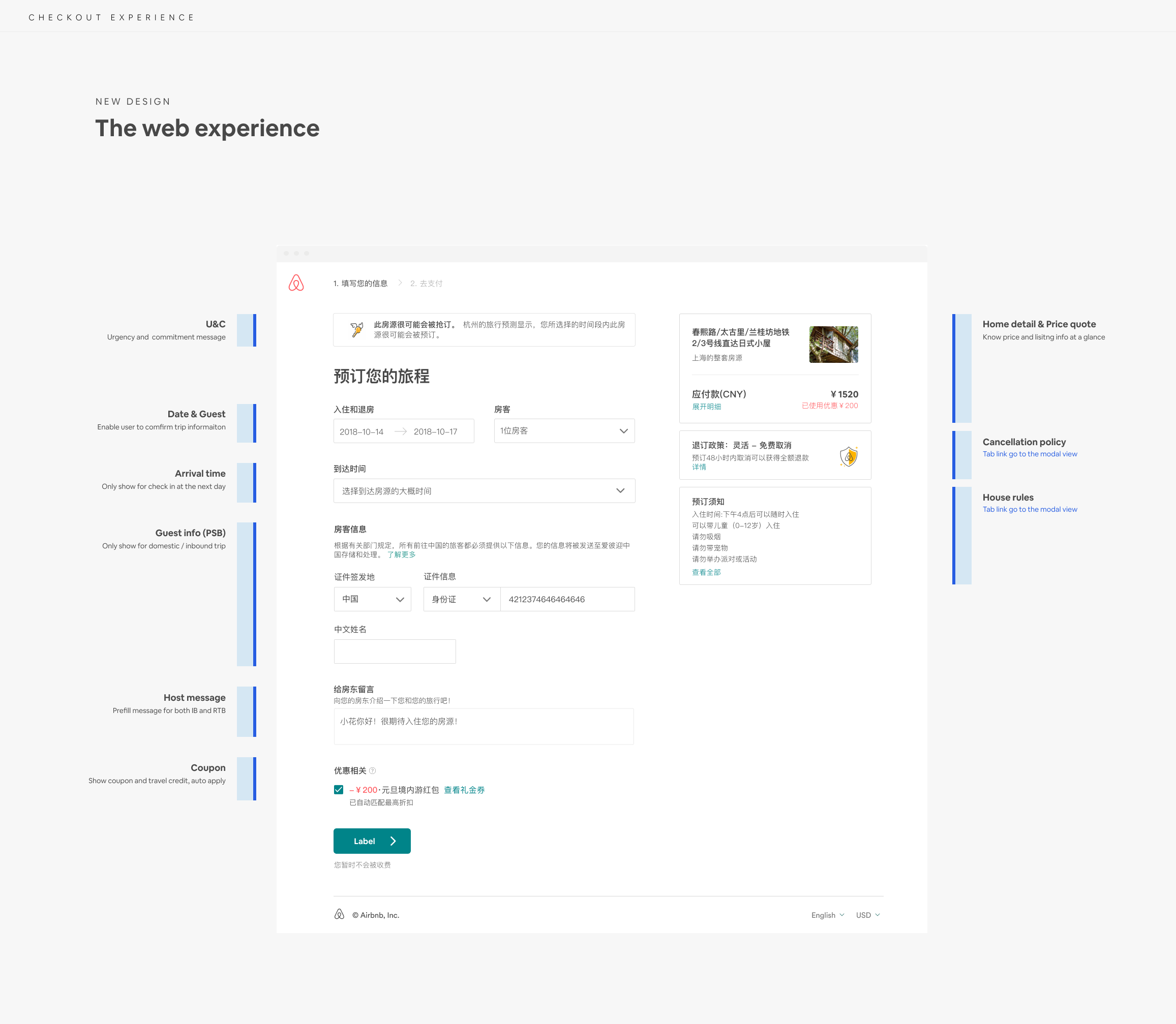
Take web as an example, I moved forward with below information architecture so that the two major types of user won’t need to jump between the left column and right column to find the things they need.
Overall page explorations
With the IA foundation in mind, I have a clear understand of which section belongs to where. I started explorations on overall page design of how each section should look like on this page. Below are some examples of my explorations.
At this stage, I set up a check-in with my PM and Eng, to make sure we are align on directions.


Final design
The new overall page and the comparison view

A closer look of different status of the sections
Similarly, here is the native design.
How about the sub-flows?
After having a good IA as baseline, I then start to explore on improving each sub flows. Guests are required to fill in many things when they book on airbnb: date, time, guest information, message to host etc.
Coupon
A brief example is Coupon - we give coupons in local ways to China user, which means no coupon code when user claim the coupon, and user have multiple coupons tie to the account. The current way to let user input coupon code obviously won’t work.
The native redesign result in a 15% drop of payment related ticket in A/B testing.

PSB (Guest ID info)
I have another project in portfolio that showcase my design for the guest information section (PSB).
I simplified the redundant flow. Resulted in 3.1% booking lift in experiment. Please view it here if you are interested.
Results
The redesign got good buy-in from stakeholders and leadership. We already launched part of the redesign, which in total brings around 1.5% lift in overall China Business (a lot!). There are more designs that are under development and testing.
From design perspective, I’m excited to bring better clarity and confidence to users through clear information architecture as well as simplified sub-flows.