Channel Memberships Offer Screen
Context
The offer screen is the face of memberships where users make decisions if they want to buy. The previous offer screen was designed when memberships product was much more basic than today. Today, the formatting and information hierarchy was difficult to determine, which makes it difficult to read what you get per price point and compare tiers. We also learnt from research that some viewers feel Memberships don't look attractive/convincing, and they don’t know how memberships and perks work.
In 2021 Q2, I redesigned the offer screen to address these pain points.
My role
Defined problems, hypotheses and workstreams to bring clarity to the complex landscape of the offer screen.
PM was OOO for a few months right after project kick-off. I led weekly project sync and XFN design reviews to drive alignment on design directions. Work directly with engs to define experiments phases.
Developed a series of hi-fidelity prototypes which identified high-value directions that solve fundamental user-problems. Influenced cross-functional adoption of product level design direction.
Frequently sync with UX peers from partner team (Commerce, ALC), to prioritize consistency and UX principles.
Worked with Platform design on new UX patterns to arrive at a final design that prioritizes consistency of YouTube.
The problem space
Summarized previous research findings and experiment learnings.


In addition to addressing the user problems we know about, I also wanna leverage the six principles of persuasion in this redesign.


1st iteration
I added icons, collapsed emoji, and showed higher value perks first to address there 2 problems:
Formatting and hierarchy difficult to decode.
Perk order does not align with viewer mental models.
In terms of navigation design, here are 3 directions which aim at helping viewers to understand memberships and compare the levels better.
Direction A - Cards
Auto expand level 1; Use chevron to expand and collapse cards; Inline button.
What worked in UXR:
Expand / collapse navigation pattern clear.
CTA “select” embedded into level with contextually relevant into.
Side-by-side comparison of levels.
What didn’t work:
Initiation of payment flow: “select” is not understood as “buy”.
Delayed discovery of all levels due to auto-expansion of “Economy” level.
Absence of signals for orientation. The volume of content pushes key elements out of sight.
Extensive scrolling required to compare between levels.
Direction B - Radio button
Auto expand level 1; Radio button selection; Persistent footer.
What worked in UXR:
Navigation pattern via radio buttons clear.
Ordering of perks, with those new to a level shown first.
What didn’t work:
Radio buttons suggest selection for purchase has been made while user may simply wish to explore.
No ability to collapse levels to compare them side by side. Extensive scrolling required.
Delayed discovery of the persistent footer as the purchase entry point.
Concern over accidentally clicking the persistent footer while scrolling.
Direction C - Slider
Horizontal navigation; Color coding; Persistent footer.
What worked in UXR:
Horizontal level selection minimizes need for scrolling.
Improved discoverability of color coding by level.
What didn’t work:
Delayed discovery of slider navigation.
Color gradient not distinct enough for clear attribution to perk icons.
No ability to view all levels side-by-side.
Accidental click on persistent footer while scrolling
On top of existing components. we have also developed new components that don’t exist today. These new components we developed based on the principles of persuasion tested - without exception - really well.


2nd iteration
Updated the design to address the key issues that were identified in UXR. One is still using the card approach, to allow side by side comparison. The other one keeps the horizontal navigation but now uses an existing YT tab component.
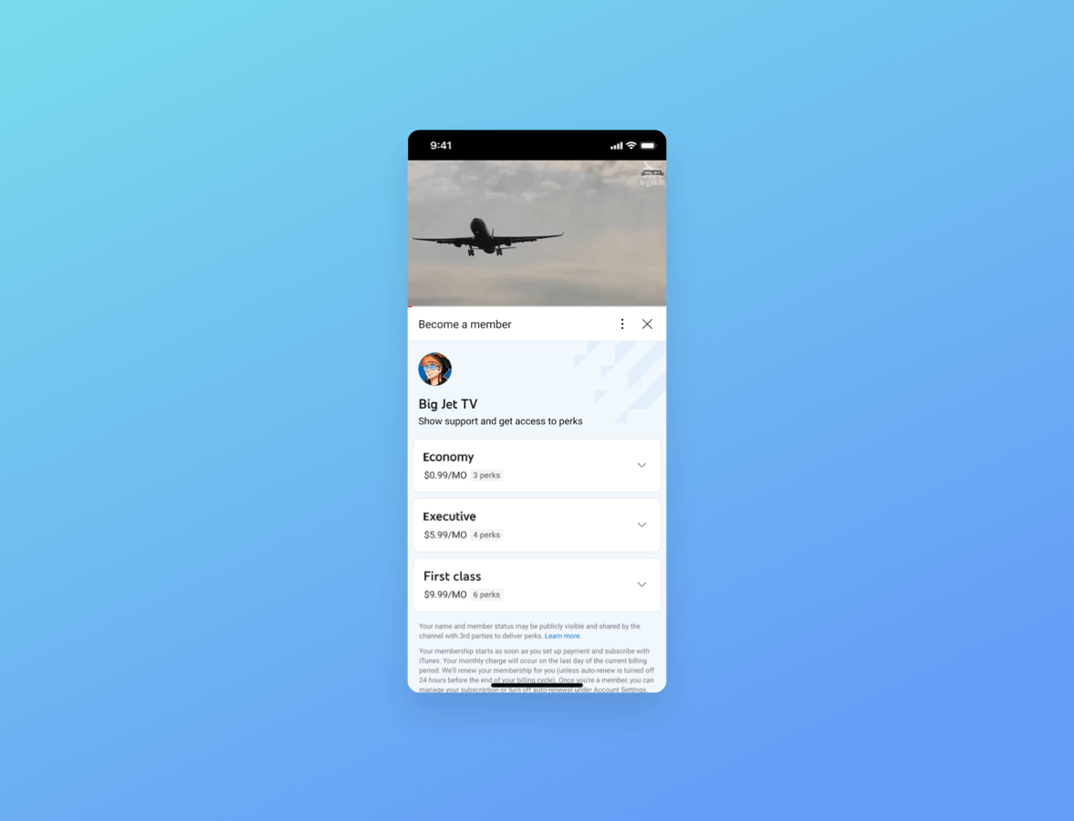
Direction 1 - Cards
Collapse cards in default view
Add level header on the top
Remove the color coding
Collapse perks from previous levels, and position it at the bottom of available perks
Include Member-only video shelf
What works in UXR:
Chip quantifying number of perks per level.
Cards and background color aide discovery and organisation of info.
Perk order, newest to level shown first.
Purchase entry point inside level makes sense.
Floating level header signpost for orientation.
Direction 2 - Tabs
Use existing tabs UI to allow horizontal comparison
Inline button
Remove the color coding
Collapse perks from previous levels, and position it at the top of available perks
Include Member-only video shelf
What works in UXR:
Navigation clear, picker makes this prototype faster to navigate.
Summary list of “perks from previous levels” makes sense in context of prototype and saves space.
What didn’t work:
More difficult to compare levels.
Level names and labels in the level picker are repetitive.
Perk order which does not start with what’s new at this level.
Final design
There were a few things we had learned about our second design iteration. Both navigation patterns work well and didn’t detect any issues for the usability tasks we had asked viewers to complete; Viewers understand offer details and levels well, and some of the key elements that help with this are the way in which we’ve now organized information differently and called out details that matter most to viewers.
After this round of research, we could conclude that design 1 was the clear winner which we iterated on for our final design.
Work with platform design team to refine visual style (example)
Feature breakdown


Before & After


“I believe that for someone who really likes the channel, they would be really excited to get to know all those levels and new possibilities here.
And that’s because the whole content was really clickable and you could see those videos. So, it was not like blank text, but you could interact with that. [...] It’s really engaging more than anything else.
You could know what exactly are the levels, what are the prices for this. So for me, there are other words like distracting or frustrating - I didn’t feel any of that because it was all clear.
”
Result
Dedicated engineering resources planned. We’ll run experiments on individual features.
Received very positive user feedback in UXR
All 8 improvements were approved in CoreX Design Review
Presented the project in UX Steering to senior leaderships
“I’m very impressed by both Xin’s and Svenja(UXR)’s work on the offer screen and hereby want send a big thank you their way :) In 11 years I have rarely seen such methodical and thorough work on designs and UX research. The CoreX reviews went super smooth and I very much like the final designs! I look forward making these concepts a reality as soon as possible.”